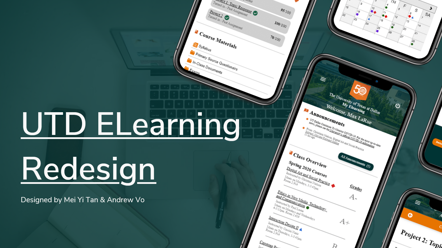
UT Dallas eLearning Redesign
Redesigning the student web portal to assist students in accessing the information they need most.
My Role
I was responsible for research activities, ideation, and assisting with wire framing.
Team
I partnered with Mei Yi Tan who was responsible for creating the final applied design and the presentation deck.
Tools Used
Balsamiq - Low Fidelity
Adobe XD - High Fidelity & Prototyping
Timeline
4 weeks

Design Challenge
How can we redesign the eLearning mobile site to better accommodate for student needs?
Overview
A design challenge sponsored by Capital One was announced a week before my university would move online because of the pandemic. The challenge continued but the pandemic raised issues regarding collaboration and user testing.
Add to this, it was my final semester at UT Dallas which meant I was juggling:
Online classes
The design challenge
Adjusting to the pandemic
Through online collaboration with Mei, we were able to redesign the university student web portal based on UT Dallas students' needs via user surveys and interviews within our 4 week time frame.
I invite you to view our prototype and experience the design for yourself.
Context
UT Dallas is home to over 21,000+ students with a significant 71% of Undergraduates living off-campus or commuting.
This stresses the importance of providing students clear and easy online access to their educational curriculum as many students may not have the ability to easily set up in-person meetings with professors.
The eLearning mobile site has had a reputation as being bloated(weight), filled with irrelevant information, and annoying to use. Our goal would be to change these perceptions by understanding the UT Dallas student and their needs when accessing eLearning.
Before

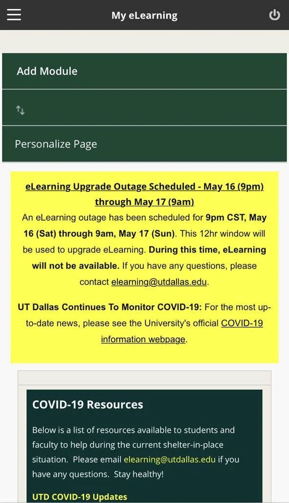
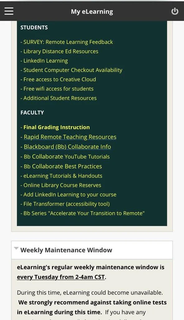
The user flow for the current design goes as follows:
After the student enters their user credentials, they are immediately faced with an effectively full-screen permissions pop up.
The students click on “Agree” and are faced with customization options and the unchanging outage schedule.
Once they scroll past that, they are provided miscellaneous student resources and faculty resources.
Finally, after scrolling past the resources, they have access to their class announcements, grades, and course pages.
Ignoring the incorrectly aligned privacy policy and the faculty resources shown on the student view. Privacy policies, customization options, and student resources are great but what are the reasons students are accessing eLearning in the first place? This is the question we set to find out.
Discovery

One of our personas
At the beginning of our process, we were interested in how current students interacted with the mobile site. Initially, we hypothesized that students wished to view their grades and notifications first.
“I don’t know why I have to scroll through so much stuff before I can access what I need.”
I looked to test this notion by creating a survey and sent it to only current students who used the eLearning mobile site. We worked together to create a list of questions we would ask participants over video calls.
However, through conducting user interviews and surveys, we found that students overwhelmingly accessed the site with the purpose of viewing due dates and turning in assignments. The greatest pain point we noticed during the interviews were the many comments on the amount of unnecessary information was on the current site.
This led us to realize that our design would need to:
Remove unnecessary information
Promote the access of student necessities (due dates and turning in assignments)
Increase the amount of “usable information” before needing to scroll
Low Fidelity

My individual lofi wireframe
First, we created multiple low fidelity wireframes to determine how much information can be reasonably shown to the student at a time. We tried using 2 modules shown side-by-side but realized that it would hinder the amount of information that could be shown depending on the screen of the student’s smartphone. (iPhone SE vs iPhone 11 Pro) Based on this consideration, we decided it would be best to aim towards providing easier reading and touch-ability for many types of devices by stacking modules on top of each other.
Second, we had to determine which order the modules would be placed. This was an important step as we did not feel like having customization would be needed because our design was focused on providing announcements, overviews, course content, and assignment turn-ins instead of providing the plethora of options as in the case of the previous design. Instead of providing the student resources within the scrollable area, we decided to tuck them into the side menu instead. This was to ensure the area that students scroll through most has only what they need and if they need more, they will still be available a click away.
Finally, if we had more time for this project, we would have begun user testing at this stage to determine what students felt provided the clearest view to what matters to them most. This would have been done by having the prototype open on a testing device and asking students to locate their announcements, classes, grades, and upcoming assignments.
High Fidelity

Our final hifi wireframe
With the core of our design complete, we needed to determine how to visually match UT Dallas’ color scheme, fonts, and iconography. Using UT Dallas’ visual guide, we were able to choose fitting colors and fonts that will match the user experience of visiting eLearning on the desktop and other UT Dallas web pages.
UT Dallas has recently turned 50 and has had a lot of fanfare regarding their achievement of being ranked #1 university under 50 years old. Because of this, we used UT Dallas’ 50-year anniversary logo instead of their classic logo. If this design would be implemented, that logo could easily be switched to its classic logo for the next year.
The design of the high fidelity wireframes was iterated multiple times to better fit the design language of UT Dallas. The colors next to the classes were changed to use the same saturation as the UT Dallas logo colors. Icons next to headlines were changed from a black to UT Dallas Orange to allow the logos to pop out more when aligned with the headers. Checkmark icons next to assignments and submissions were changed to be UT Dallas green.
We created a prototype that demonstrates the user flow of a student seeking to view their announcements, class overviews, current due dates, and to turn in assignments.
I invite you to view our prototype and experience the design for yourself.
Evaluation

While the challenge was going on, the pandemic was spreading throughout the United States and our area experienced a Stay-At-Home order. This was disheartening as our user survey noted that the main reason to use the eLearning mobile site was for on-the-go use. We felt that the data collected by testing users at home would not truly represent the experience of using the app on-the-go.
Because of this, we created a testing framework based on Guerrilla Usability Testing which would allow us to apply contextual inquiry once the situation returned to normal.
Conclusion
Finding what students accessed eLearning for allowed us to prioritize goals for our users.
Overall view of their education
Keeping up with assignment due dates
Submitting assignments
Unlike the previous design, our design promotes access to student necessities and aims to help make managing school online easier and faster.
Reflection
If I had a chance for a do-over, I would’ve conducted our user interviews before our survey. I found that surveying before getting the insights regarding students’ needs led to questions being on the survey that had little relevance to how students used the site. I believe doing so would allow our survey questions to have been more directly tied to the student experience.
This was an excellent experience to not only design something that I cared to see changed but to also work with a designer who’s open-mindedness allowed for lots of debates regarding “What was essential?” and “How do we determine if it is essential?”.
I felt like this project allowed me to grow as a designer and reminded me that design is not a solo endeavor but a group triumph.
Supplementary Files